

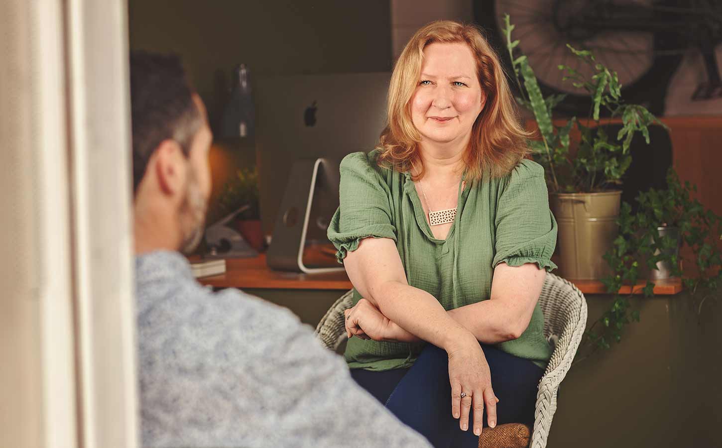
One of the nicest compliments we’ve ever had from a client came before we’d started creating a single page of their new website.
We’d spent time asking questions about their business, looking at how people were using their existing website and talking about what they wanted it to achieve. At the end of the meeting they said, “Nobody’s ever asked us those sorts of questions before.”
That’s because, for us, designing a website doesn’t really start with design, it starts with understanding.
It’s easy to imagine that a web design project begins with talking about how the brand will be applied, choosing colours, deciding layouts or searching for inspiration.
Those things are part of the process, but they come much later than most people expect. If you jump straight into creating a website without understanding what the business needs the website to do, you’re really just making decisions based on guesswork and what looks nice.
The more we understand about a business, the easier it is to make good decisions later on and to ensure that everything we do has both the business and the target market in mind.
That doesn’t mean endless workshops or complicated strategy sessions. In fact, it’s usually the opposite. It means having sensible conversations about who the website is for, what people are looking for when they arrive and what you want them to do once they’re there.
Sometimes those conversations reveal that the problem isn’t what the client thought it was.
A business might tell us they need a bigger navigation menu because they’ve added more services over the years. After talking it through, we might realise that the issue isn’t that there are too few pages – it’s that visitors don’t know where to start when they land on the site. Adding more options would probably make that worse, not better.
Or someone might say they want the homepage to include absolutely everything they offer. Again, it’s understandable. Nobody wants to leave anything out and they might know that the homepage is the most visited on their existing site.
But people rarely arrive on a website hoping to read everything. They’re usually trying to answer one or two questions as quickly as they can, or get some sense of connection or reassurance that they’re in the right place and the website works much better when it helps them do exactly that.
One of the things we enjoy most is working out how to make information feel simple.
Not simplistic, because that’s different. Businesses are often complex, and there’s no point pretending otherwise.
But a well-structured website helps people understand things in manageable steps, rather than presenting everything at once and hoping they’ll work it out for themselves.
That’s where planning of what content goes where becomes so valuable.
So we spend time mapping out the structure of a website. Which pages are really needed? How do they connect to one another? What questions is each page answering? If someone lands halfway through the site from Google rather than on the homepage, will they still understand where they are and what to do next?
They’re not questions about design and what colour goes where, but they make an enormous difference to the success of the end result.
It’s a bit like designing a house. You wouldn’t choose the curtains before deciding where the rooms go. The layout comes first because that’s what determines how the building actually works. Once that’s right, you can start thinking about the details that give it personality. Websites aren’t so different.
The design itself is important, of course. We care about typography, spacing, photography and all the little details that make a website feel professional and enjoyable to use. That’s why we have put so much time and effort into the design of Tent Flex. But good design should support the content, not distract from it. If people notice how clever the design of a website is but still can’t work out what the business does, or how to get the answer to a question they have, something has gone wrong.
The best websites tend to feel surprisingly effortless. Visitors don’t stop to admire the navigation because they simply find what they’re looking for. They don’t think about the page structure because it all feels obvious. They aren’t consciously analysing the typography or spacing. They just come away with a sense that the business feels organised, professional and easy to deal with. That’s exactly what good design should do.
Looking back over the websites we’ve created over the years, the projects we’re most proud of aren’t necessarily the ones with the most dramatic visual transformation. They’re the ones where people tell us they’re having more success because the website is doing a better job of explaining who they are and what they do. In the end, that’s what matters, it’s all that matters really.
A website isn’t there to win design awards. It’s there to make life easier for the people using it, and to work harder for the business behind it.
That’s why we spend so much time thinking before we start designing. Not because we like making things complicated, but because experience has taught us that the more thought you put in at the beginning, the better the result at the end.